Prego
Pasta & Sauces
Malaysia's Market Leader In Pasta and Sauces
- Brand Strategy
- Brand Architecture
- Portfolio Management
- Creative Development
- Packaging Design
- Production
Campbell's / Prego Malaysia
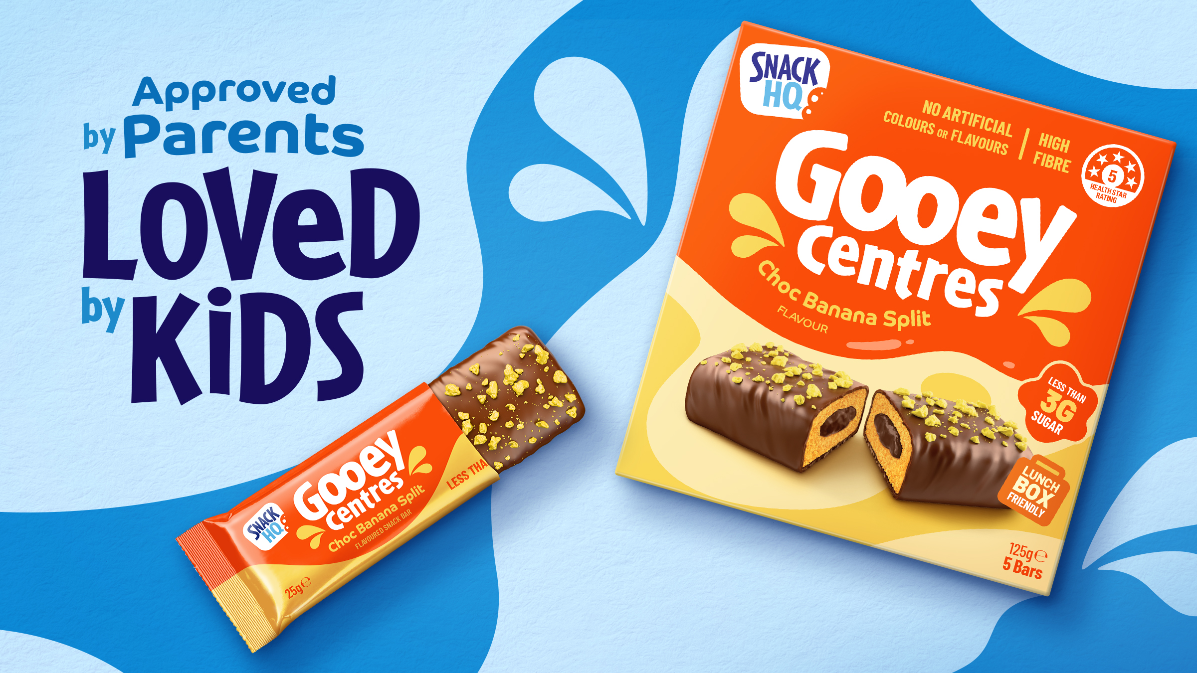
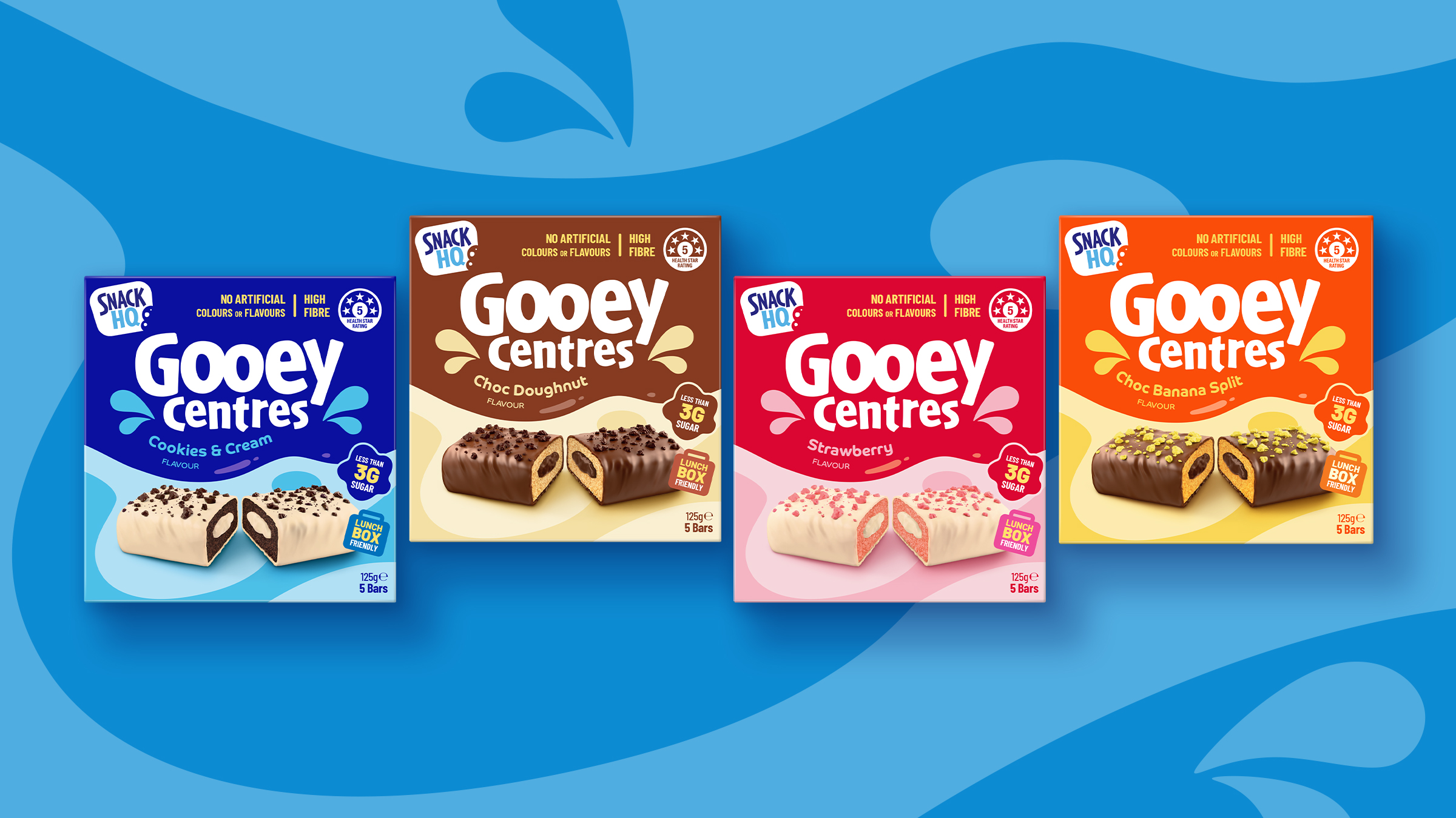
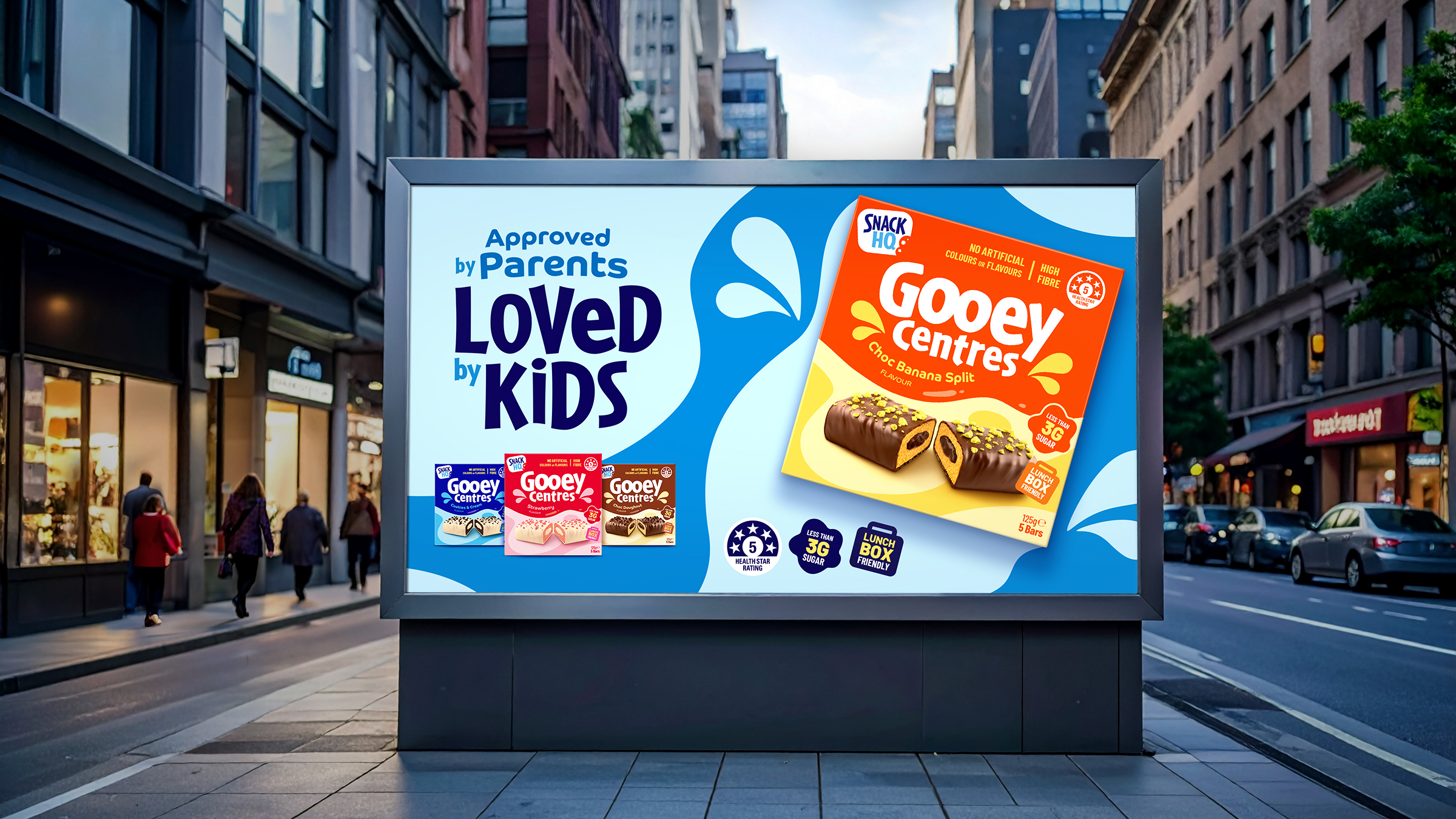
The Challenge
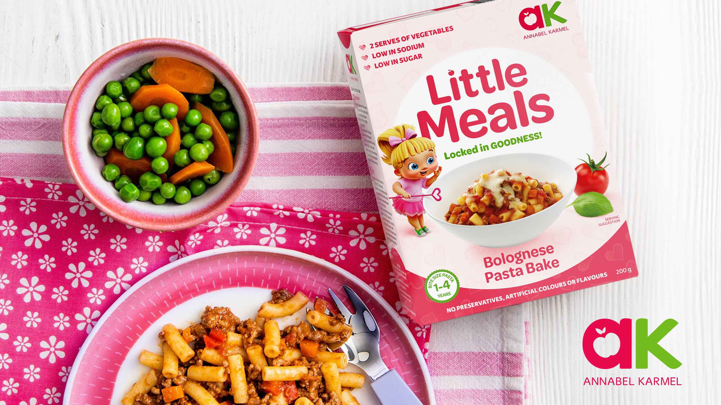
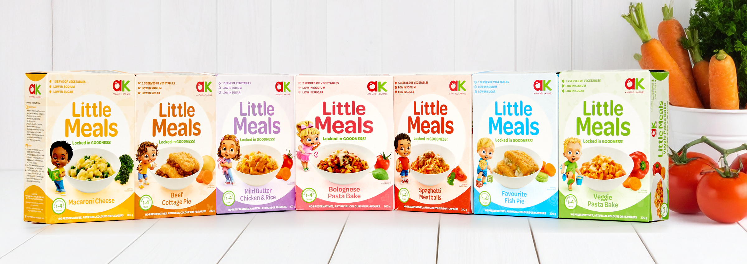
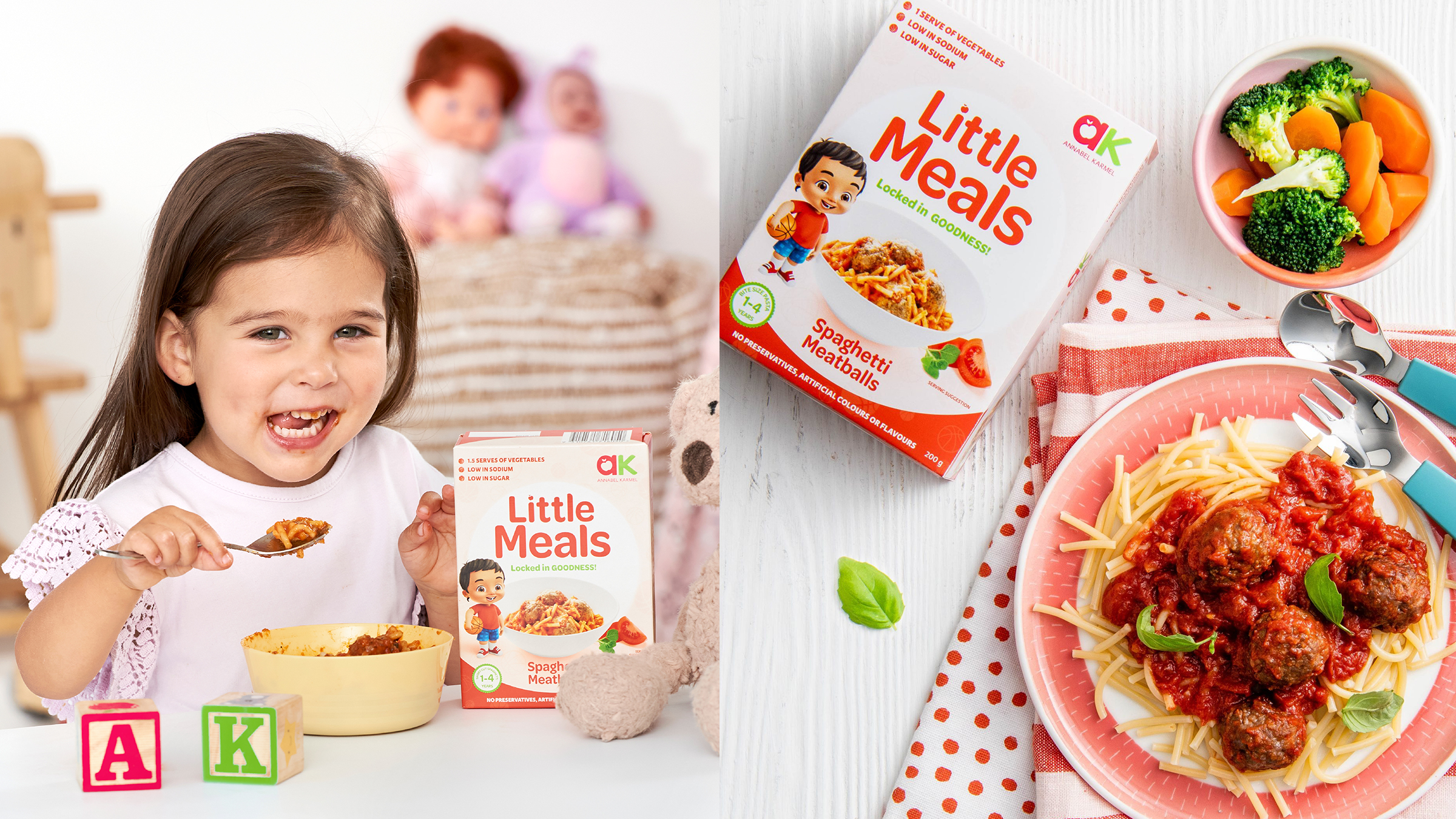
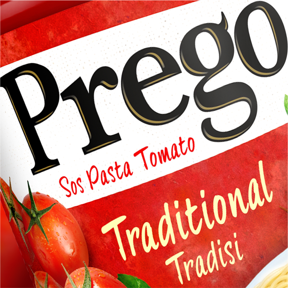
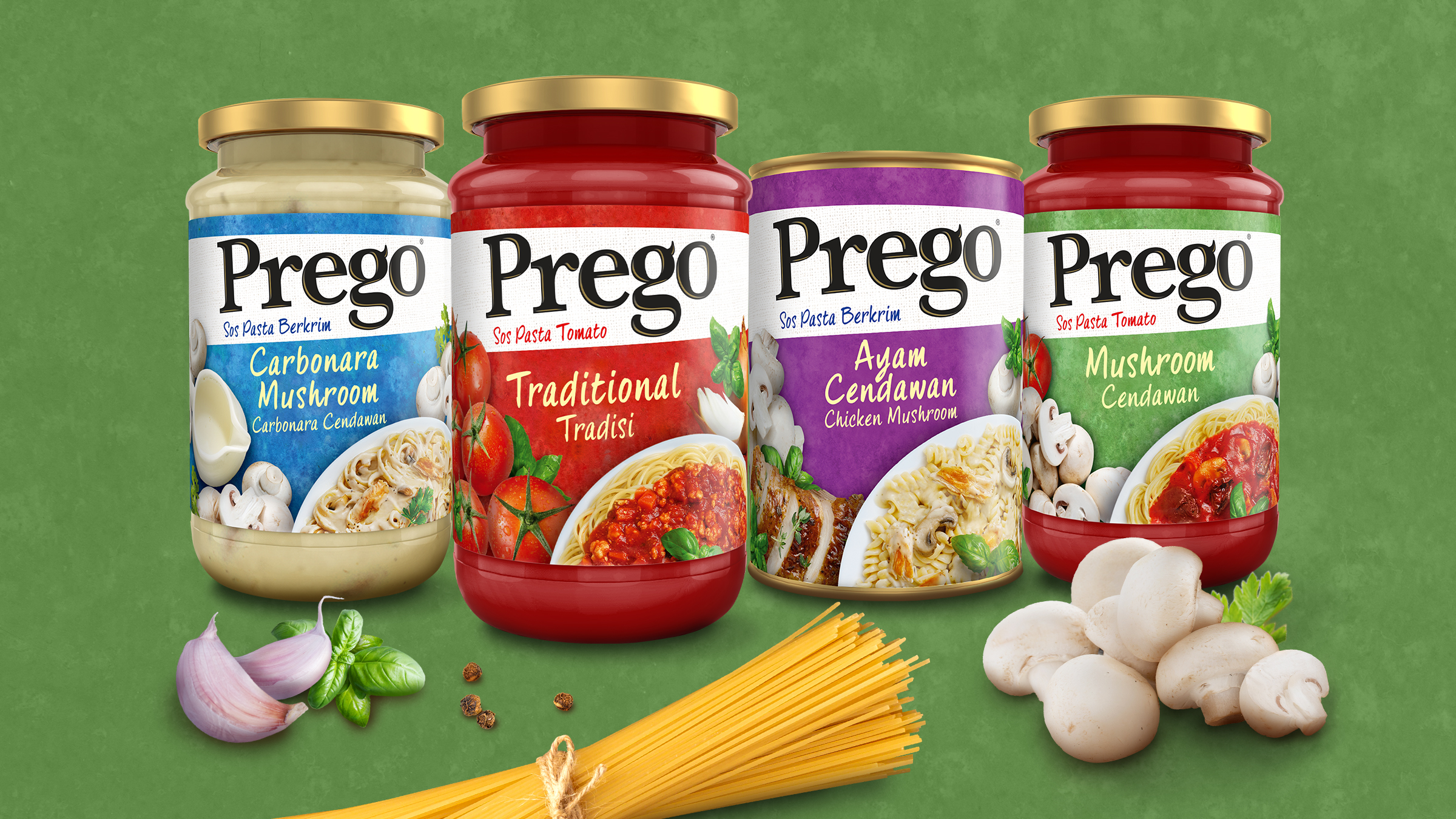
Prego, Malaysia’s No.1 pasta and sauce brand, needed a packaging refresh to highlight quality ingredients and easy preparation while maintaining its appeal as an everyday family favourite.
The Insight
Consumers associate quality with fresh ingredients. The design focused on vibrant photography of real ingredients, tomatoes, mushrooms, cheese, alongside appetising meal imagery to inspire confidence and purchase.
The Impact
The refreshed packaging created a strong, cohesive range look, enhancing shelf appeal and brand recognition. Clear visuals reinforced trust and convenience, strengthening Prego’s leadership in the category.
The Challenge
Prego, Malaysia’s No.1 pasta and sauce brand, needed a packaging refresh to highlight quality ingredients and easy preparation while maintaining its appeal as an everyday family favourite.
The Insight
Consumers associate quality with fresh ingredients. The design focused on vibrant photography of real ingredients, tomatoes, mushrooms, cheese, alongside appetising meal imagery to inspire confidence and purchase.
The Impact
The refreshed packaging created a strong, cohesive range look, enhancing shelf appeal and brand recognition. Clear visuals reinforced trust and convenience, strengthening Prego’s leadership in the category.