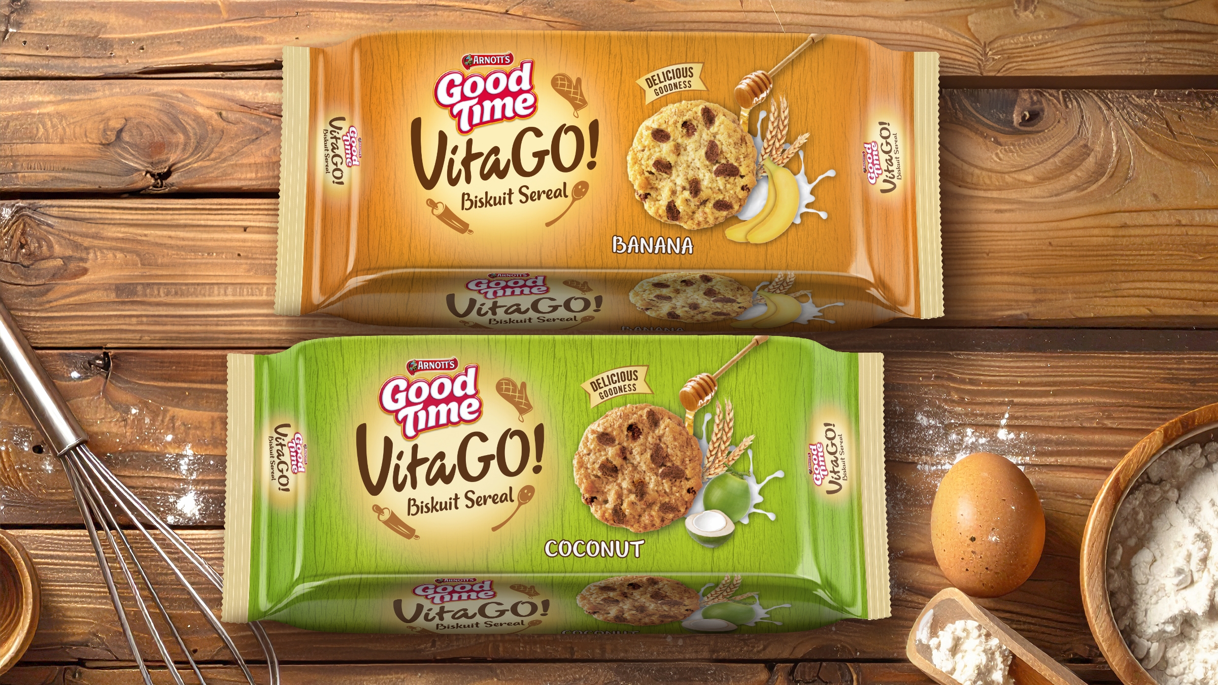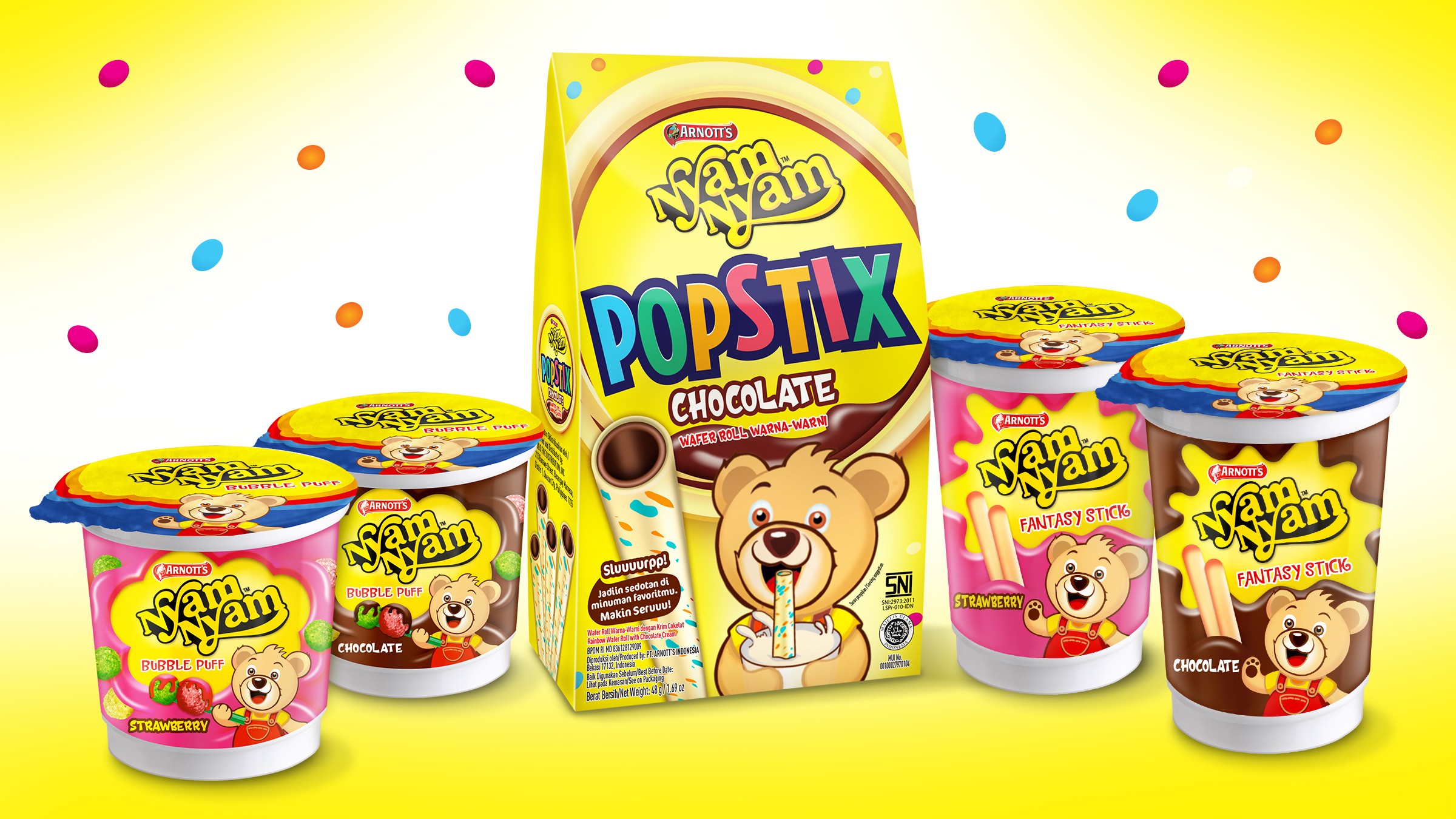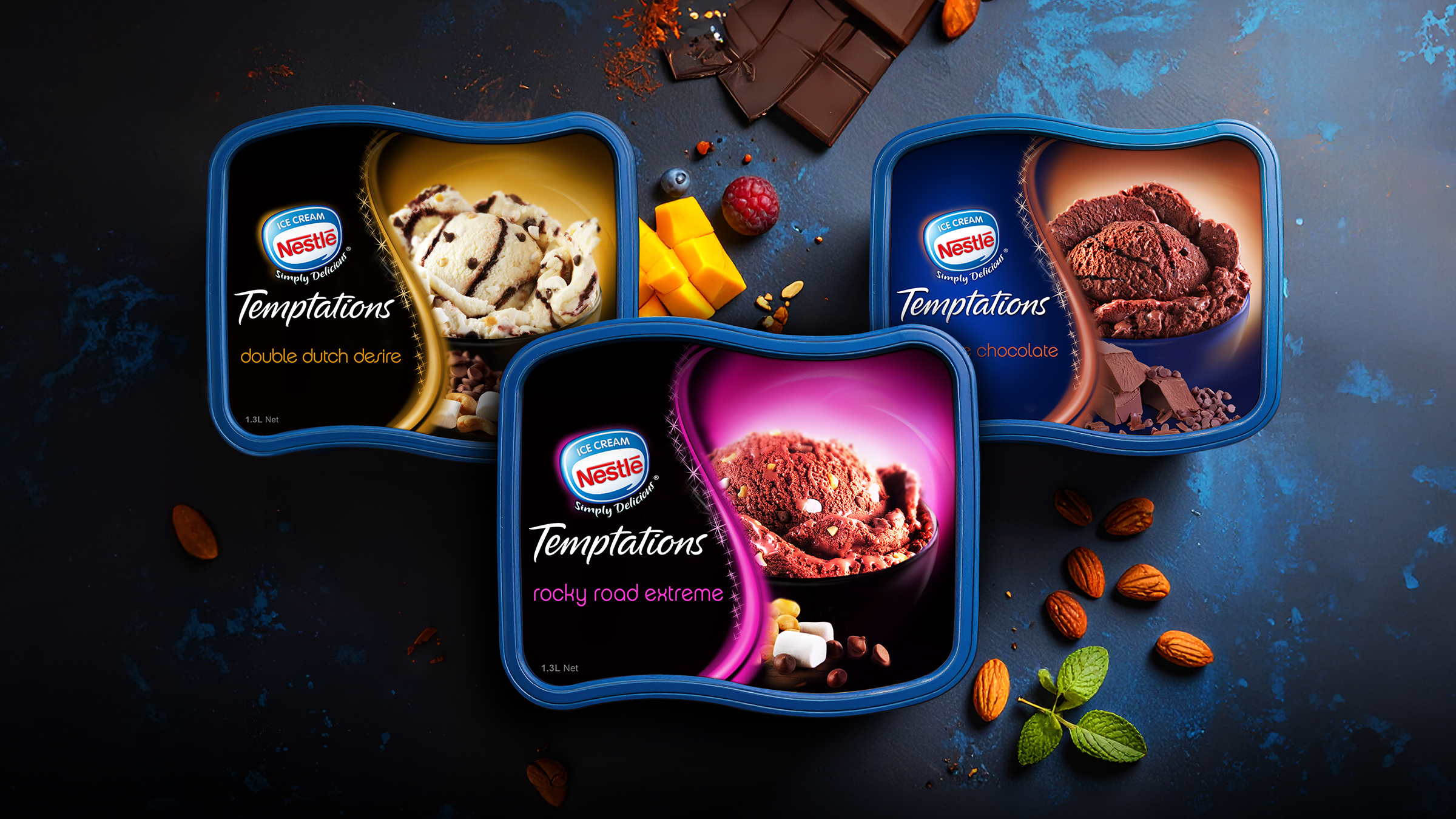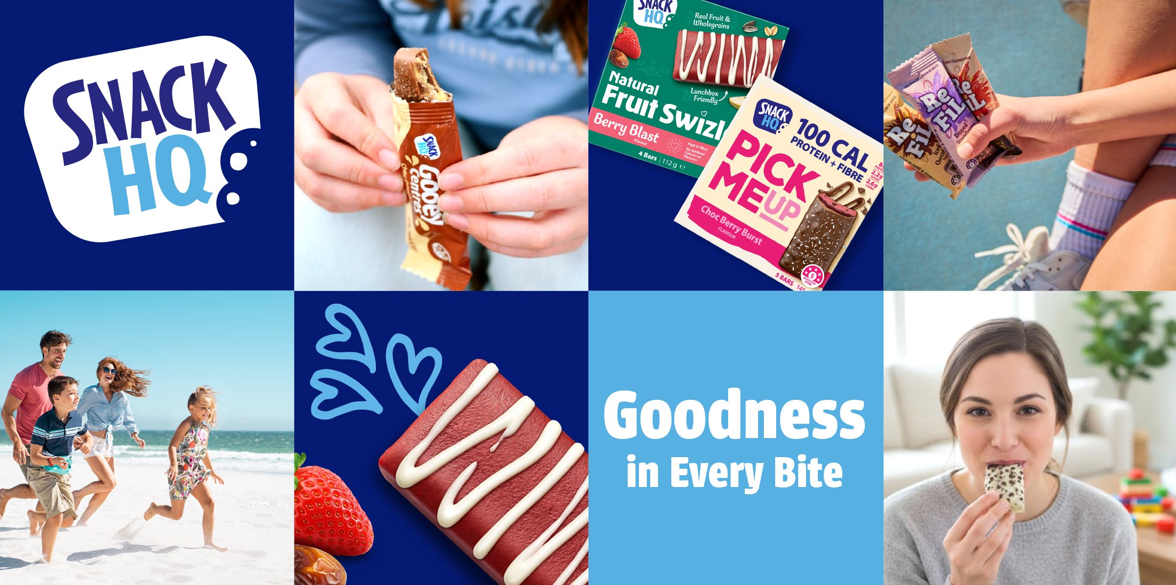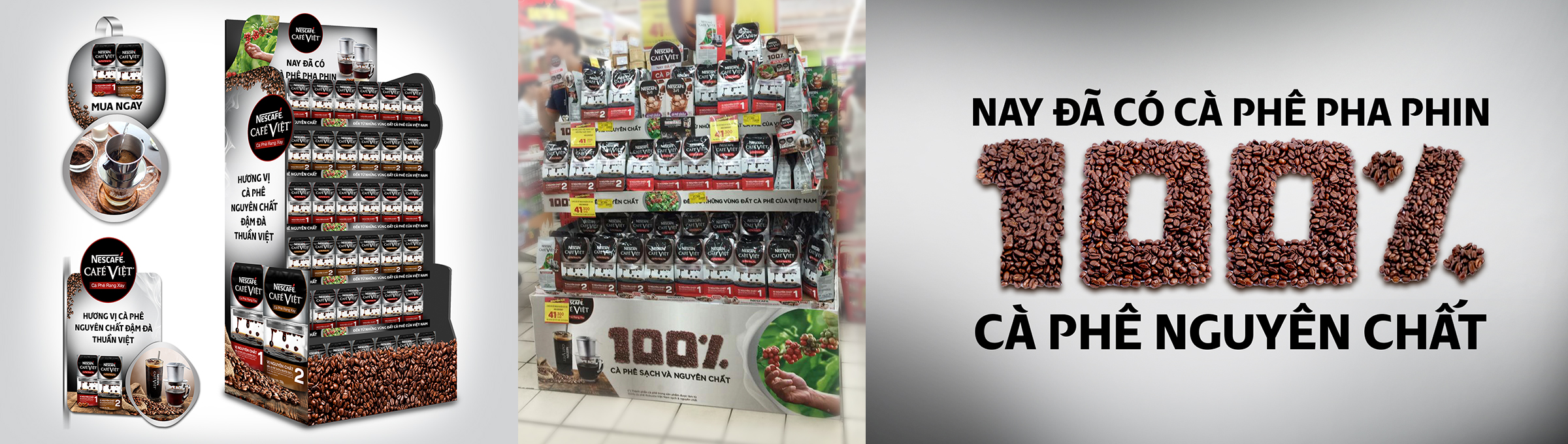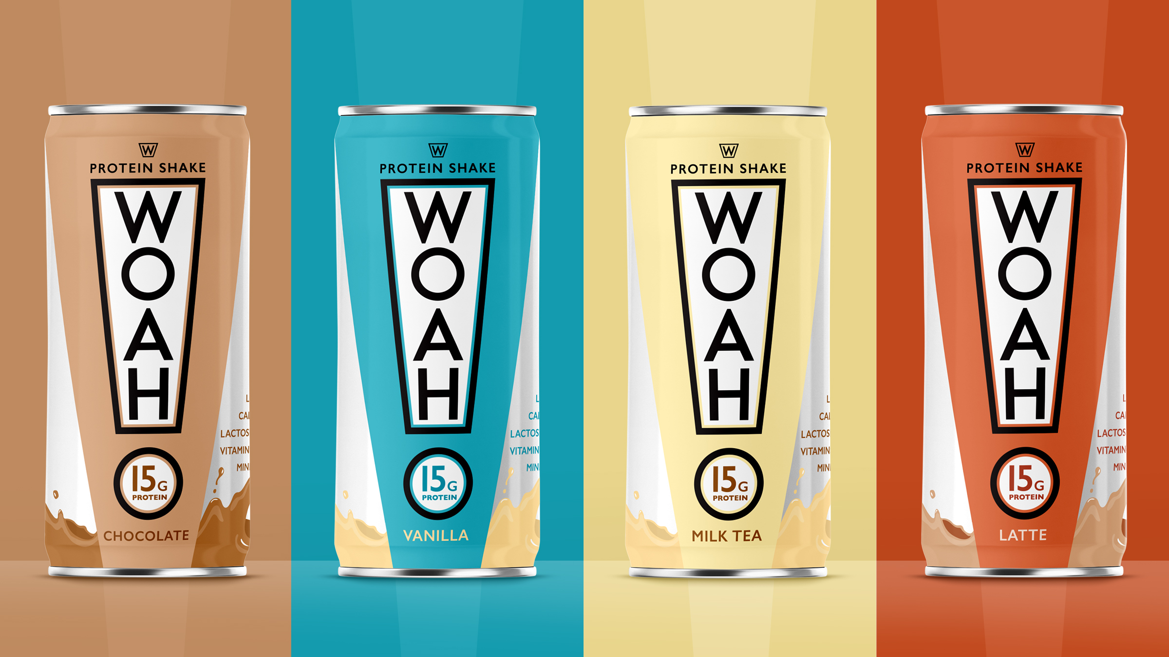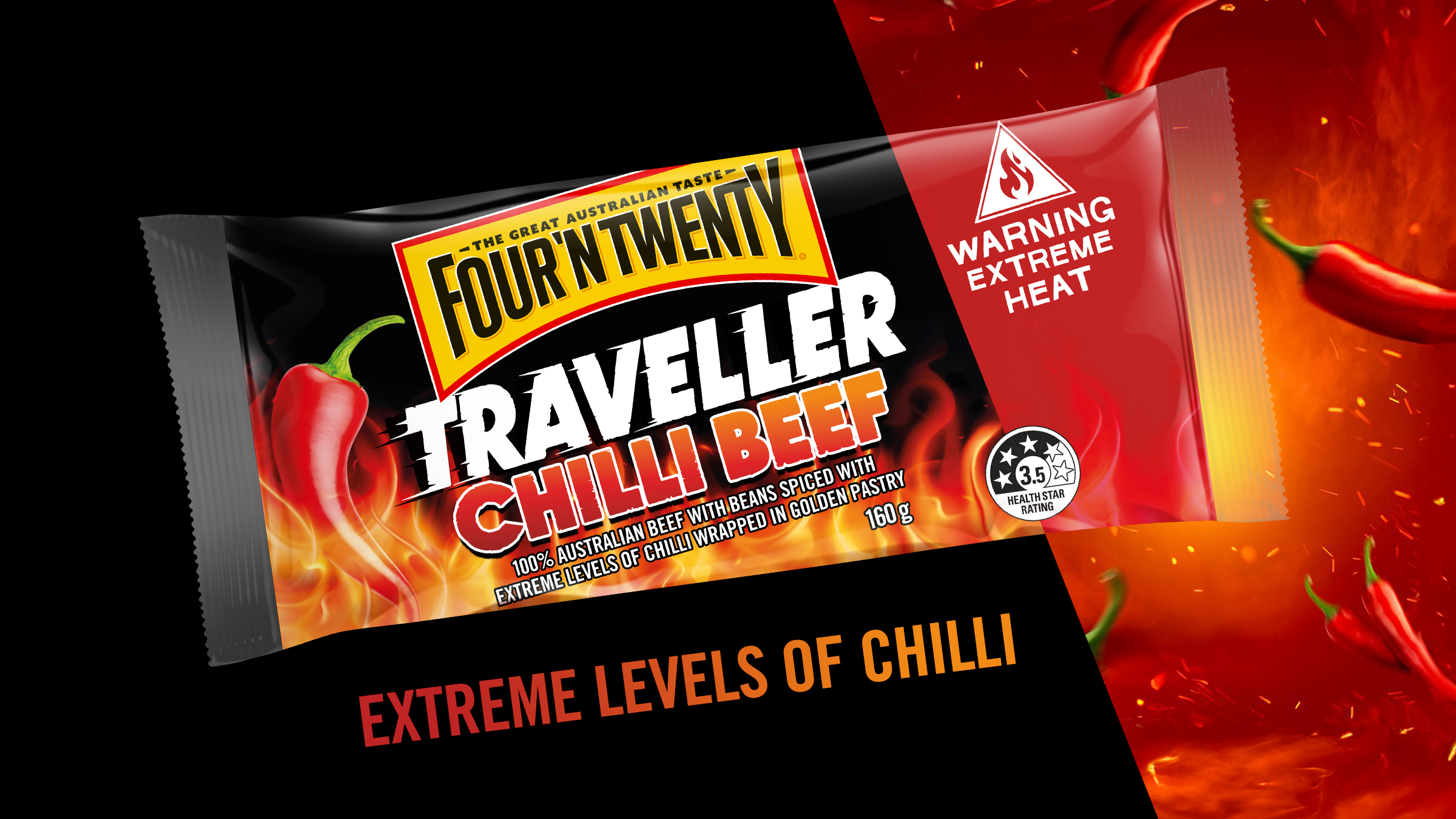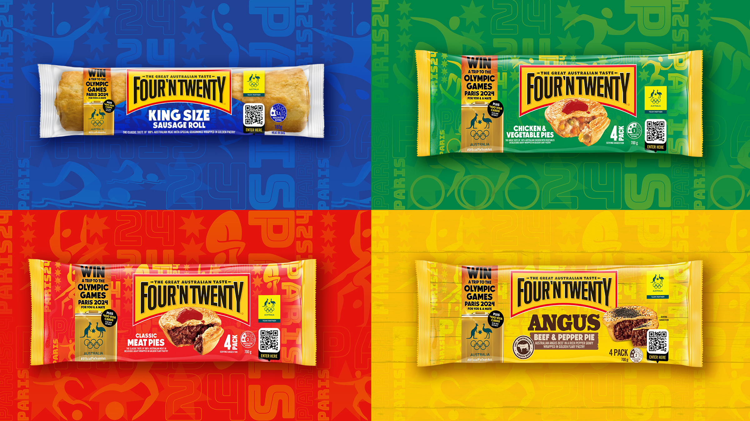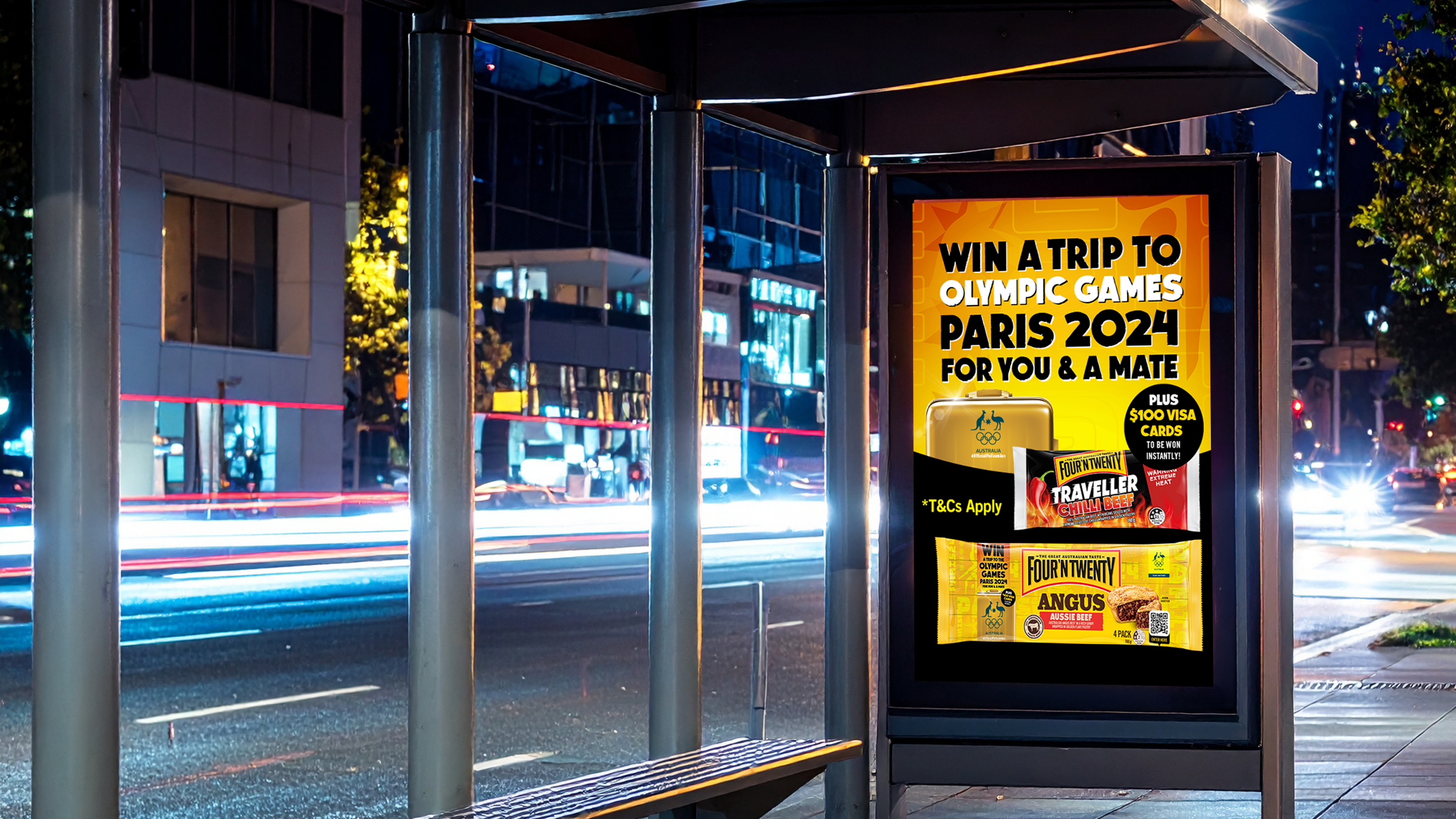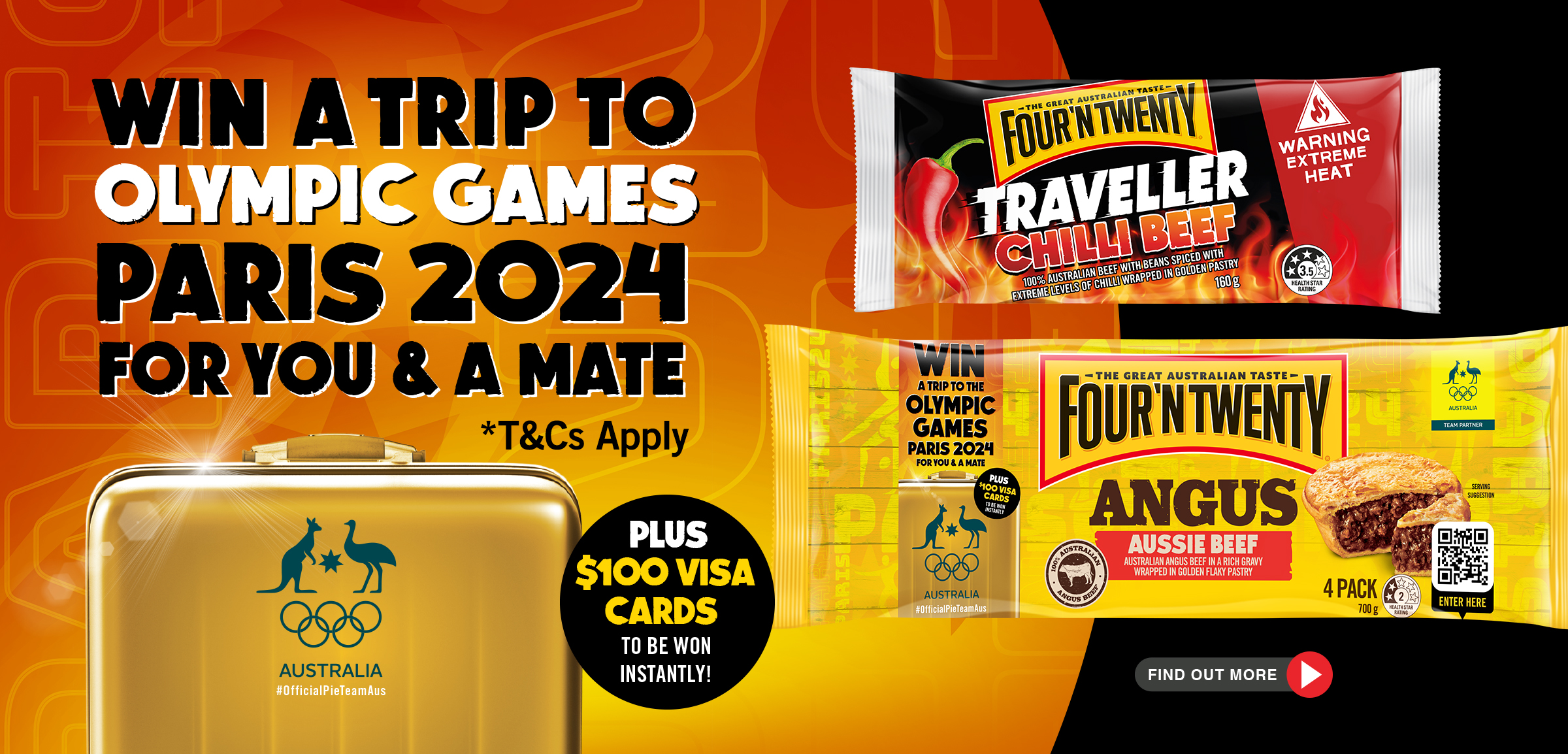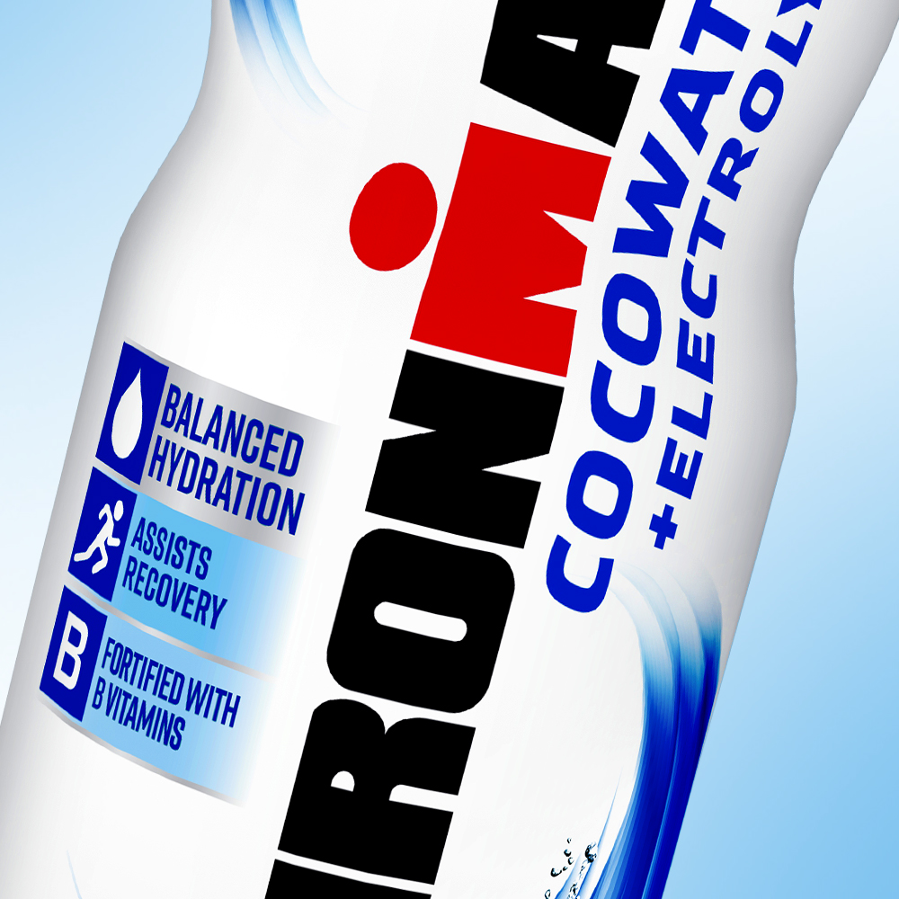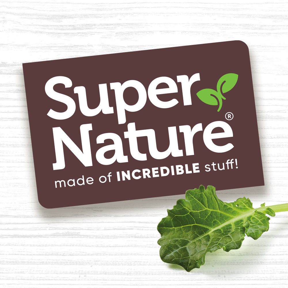
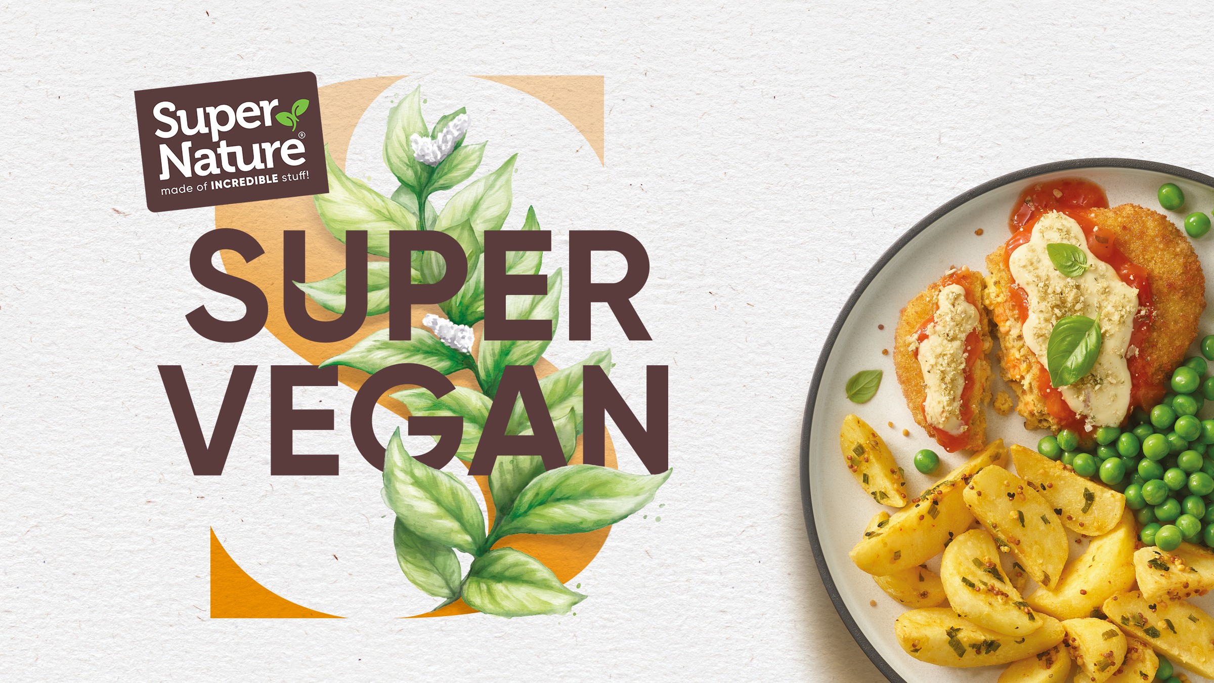
Super Nature
Frozen Meals
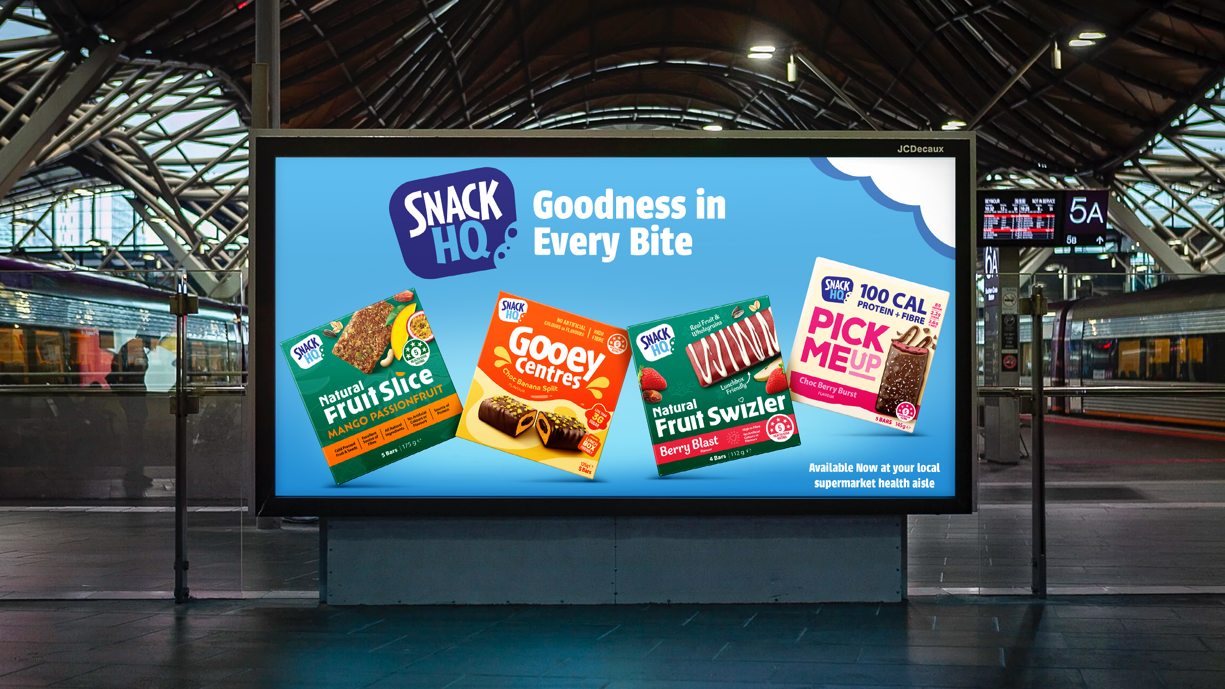
Redefining Frozen Convenience
- Brand Strategy/Positioning
- Brand Architecture
- Portfolio Management
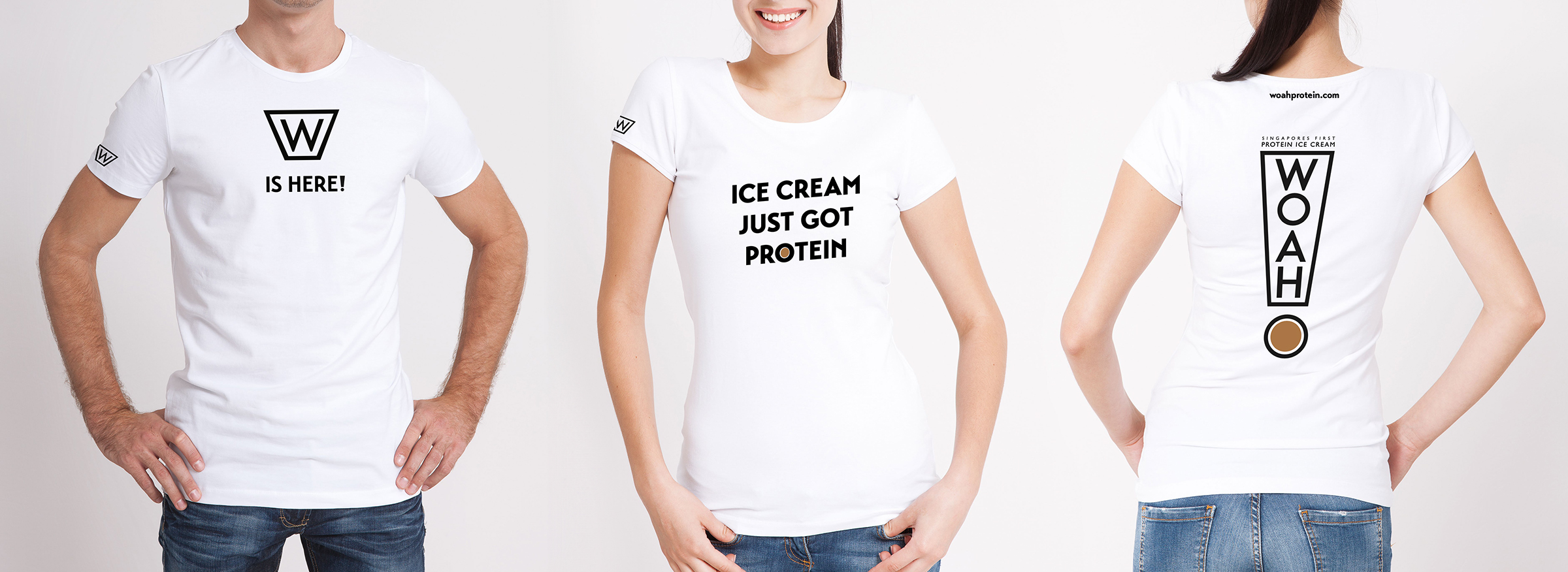
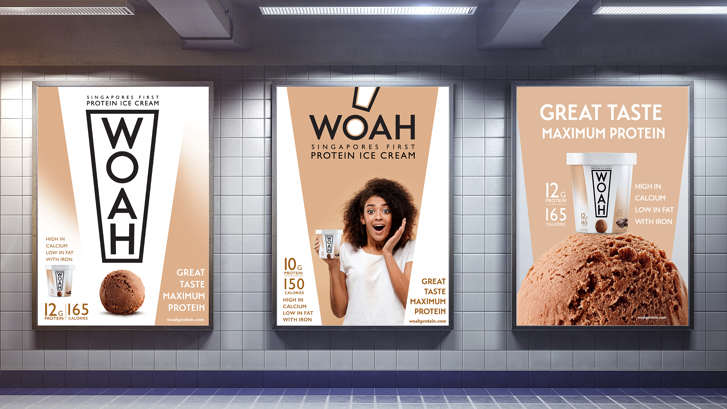
- Creative Development
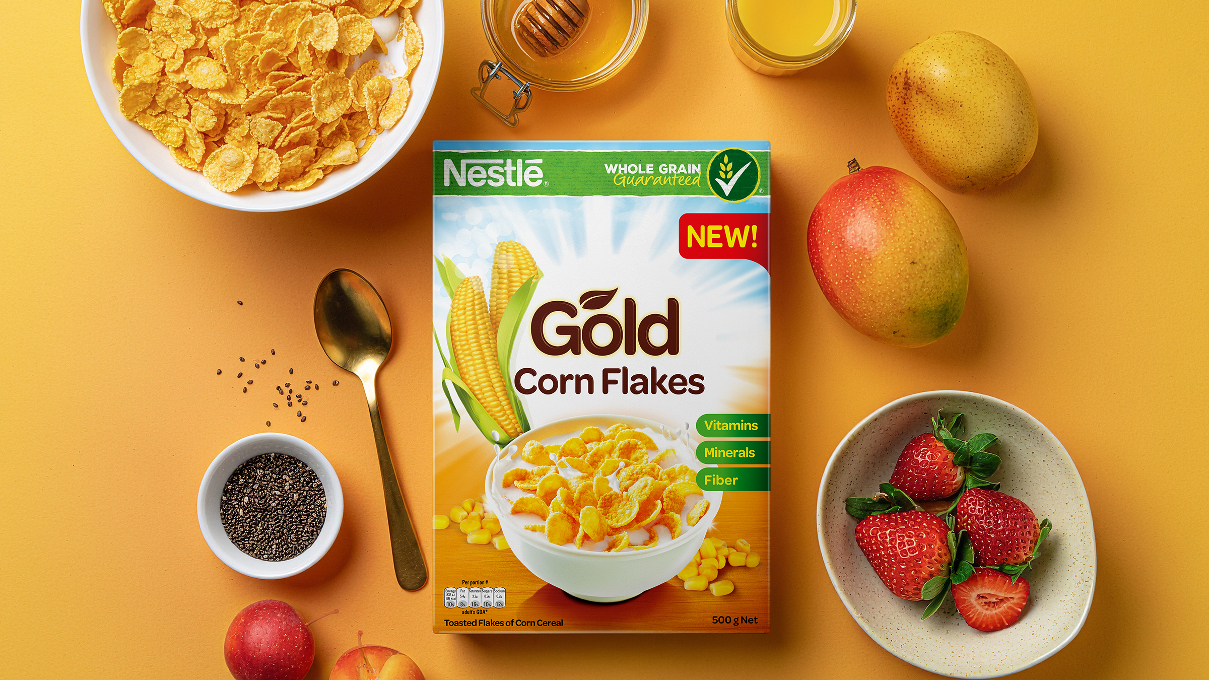
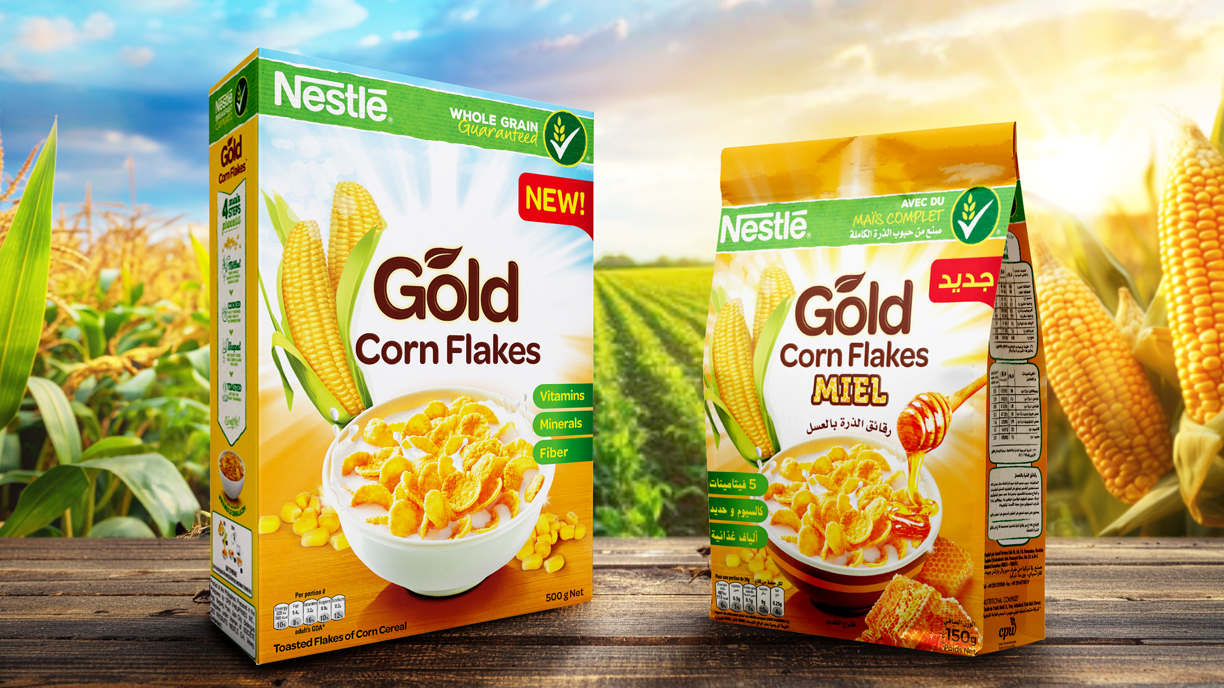
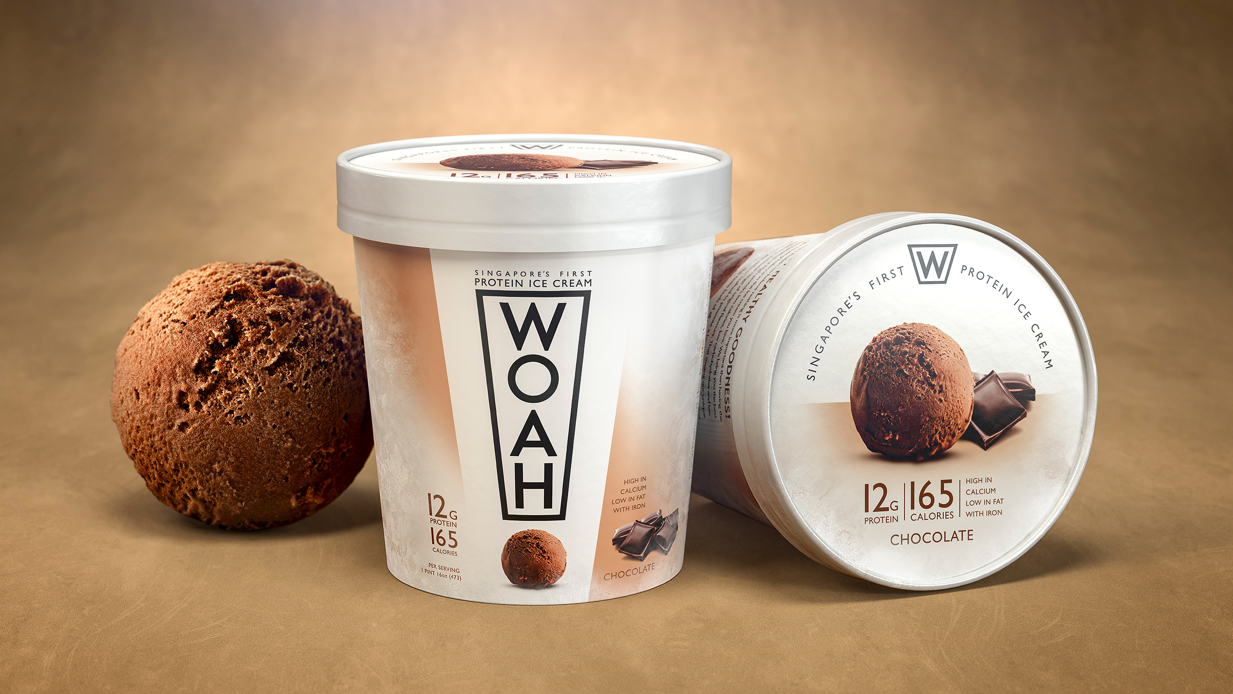
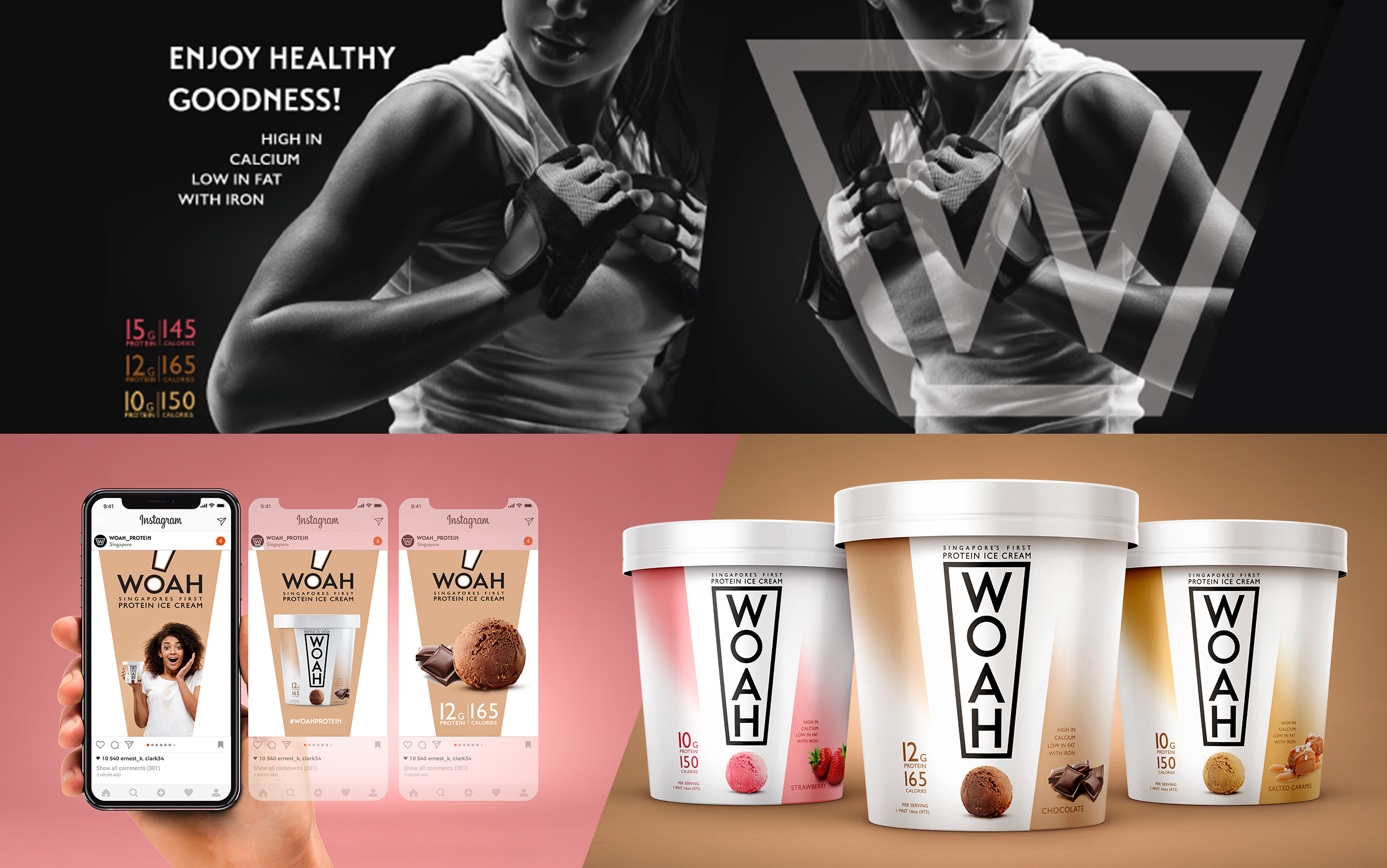
- Packaging Design
- Digital / Social Campaign
- Brand Guidelines
- Production
Patties Food Group / Australia
The Challenge
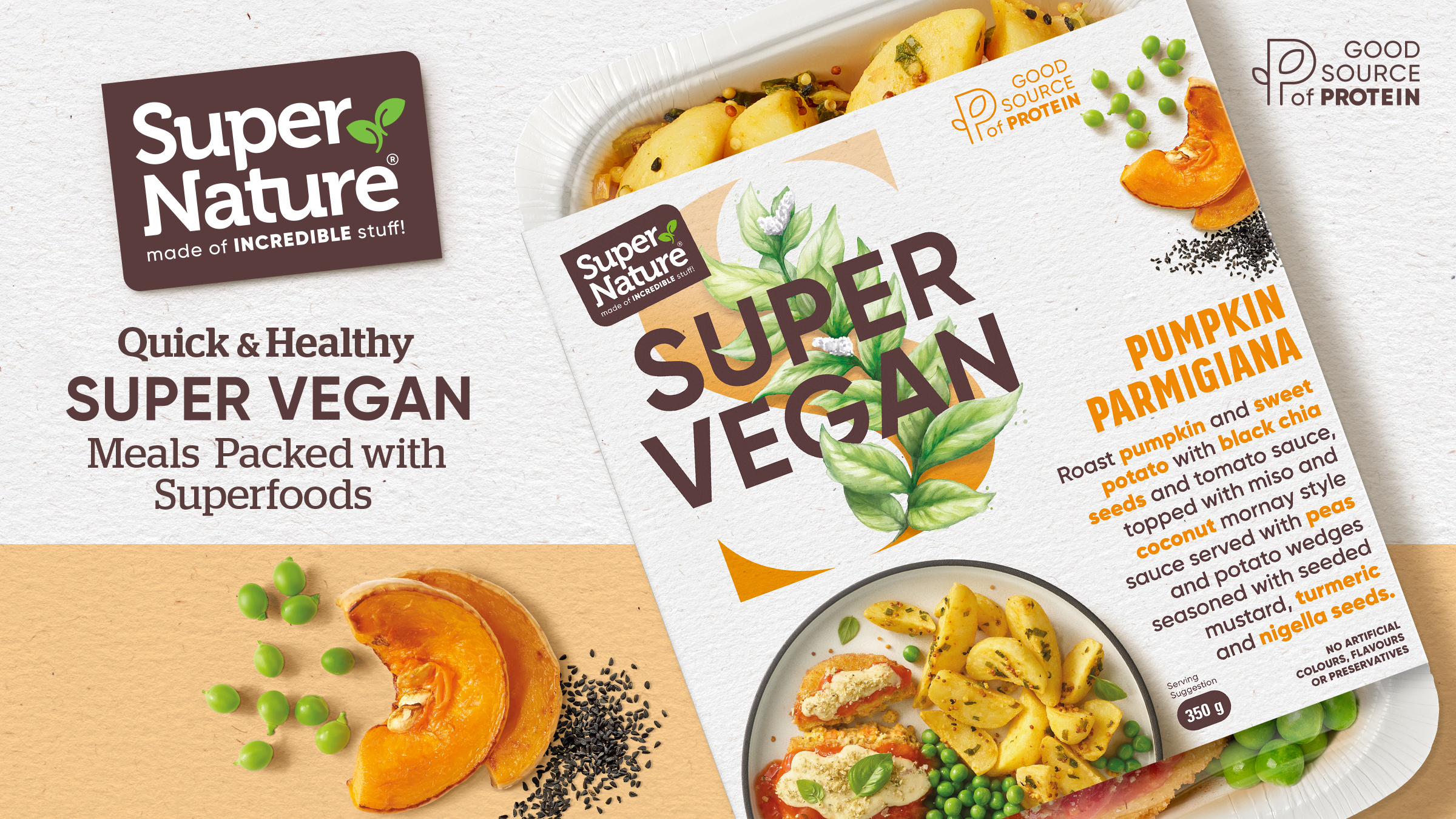
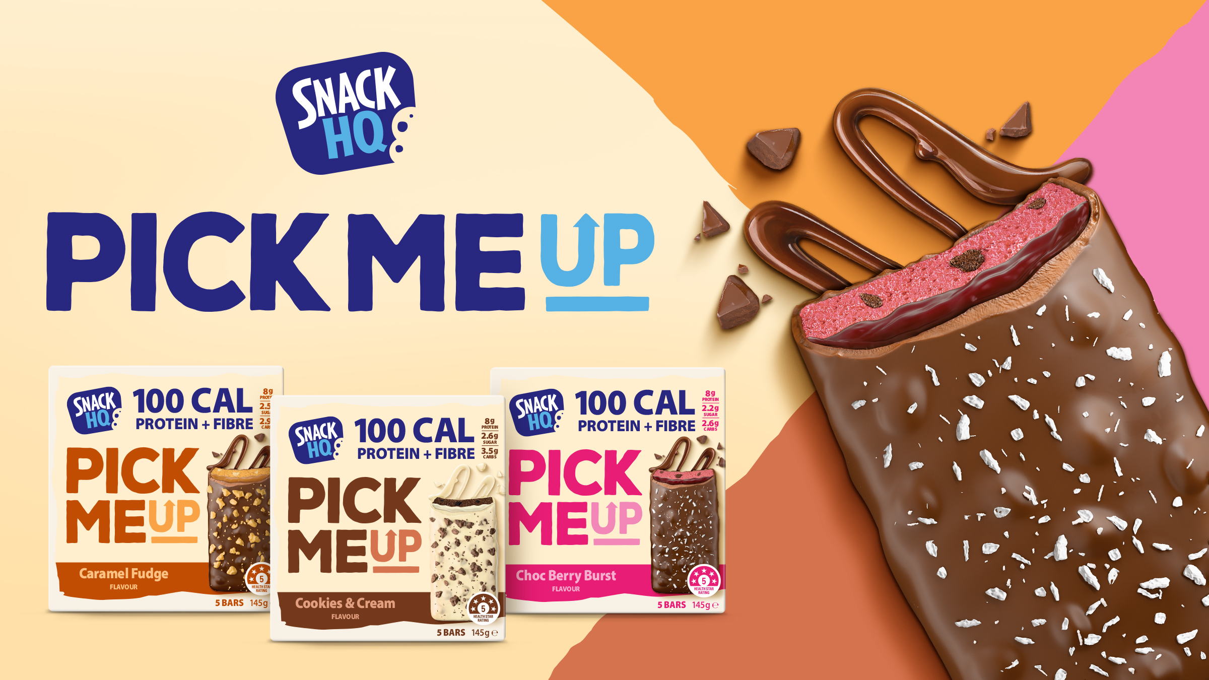
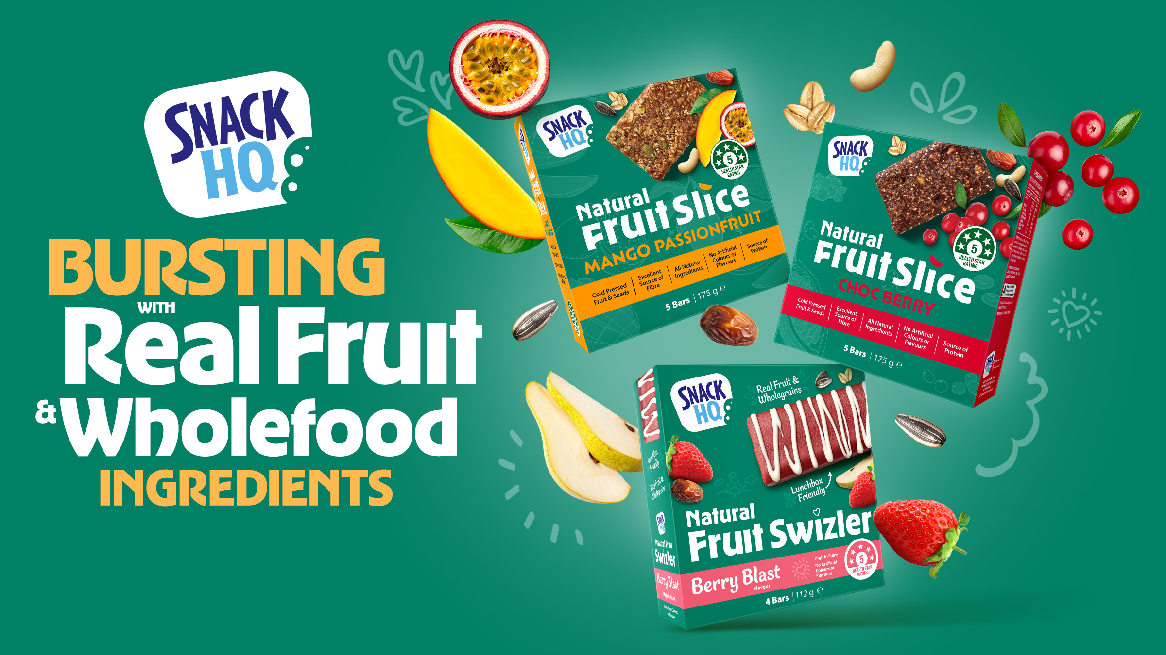
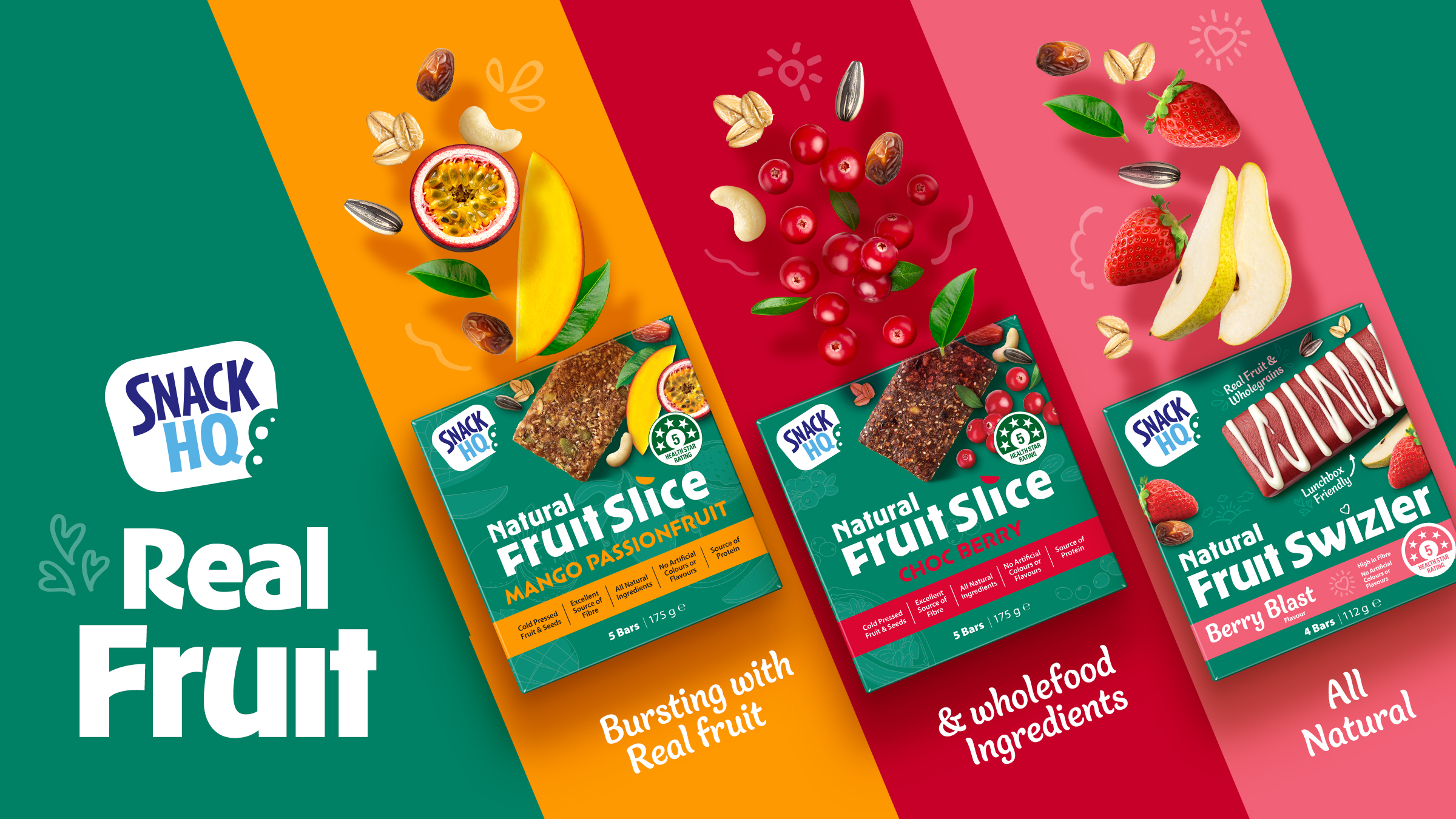
Vesco Foods set out to reinvent the freezer aisle with a brand that could break stereotypes proving that frozen meals could be both healthy and delicious. The goal? To attract health-conscious consumers while maintaining strong taste appeal.
The Insight
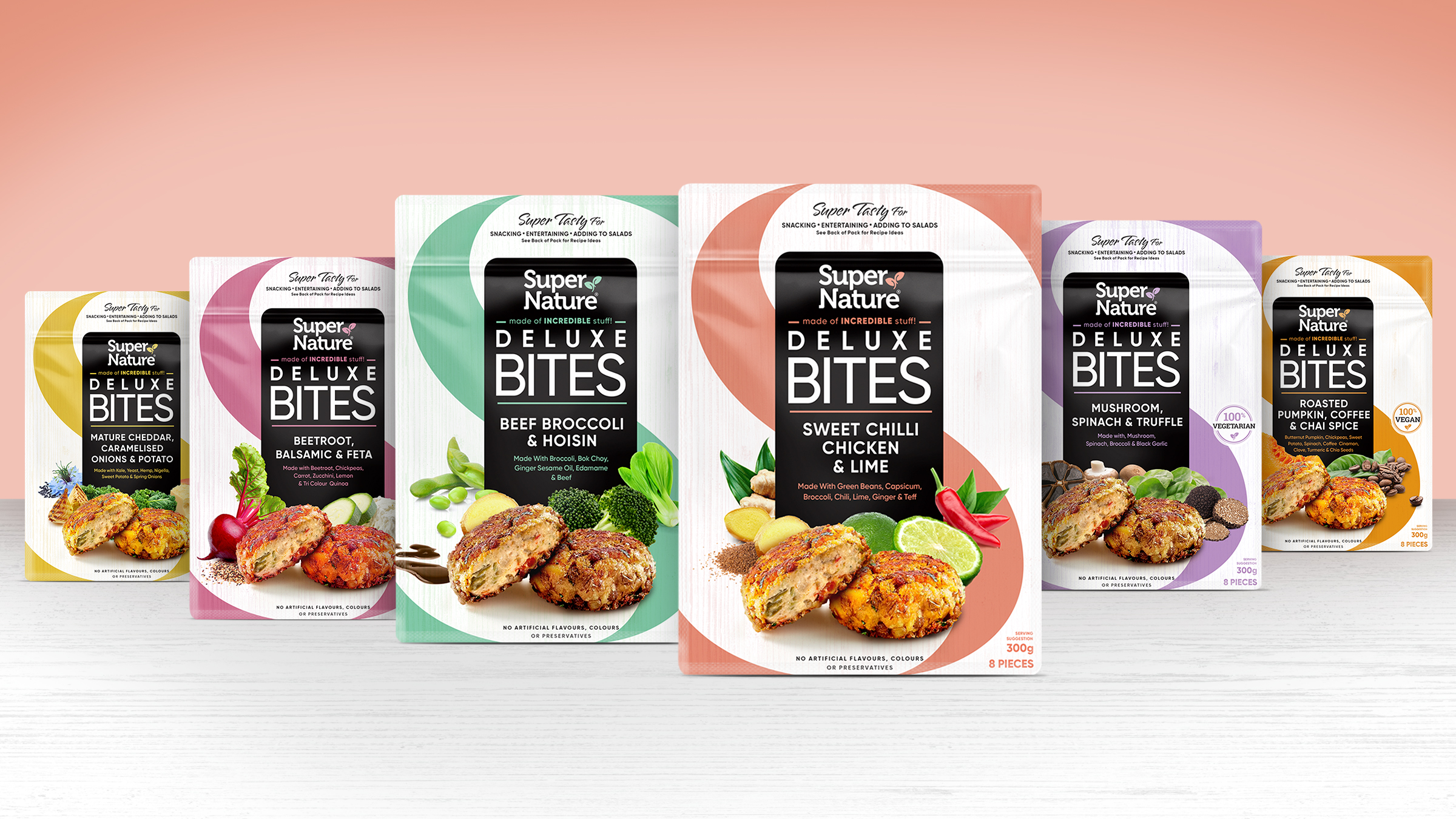
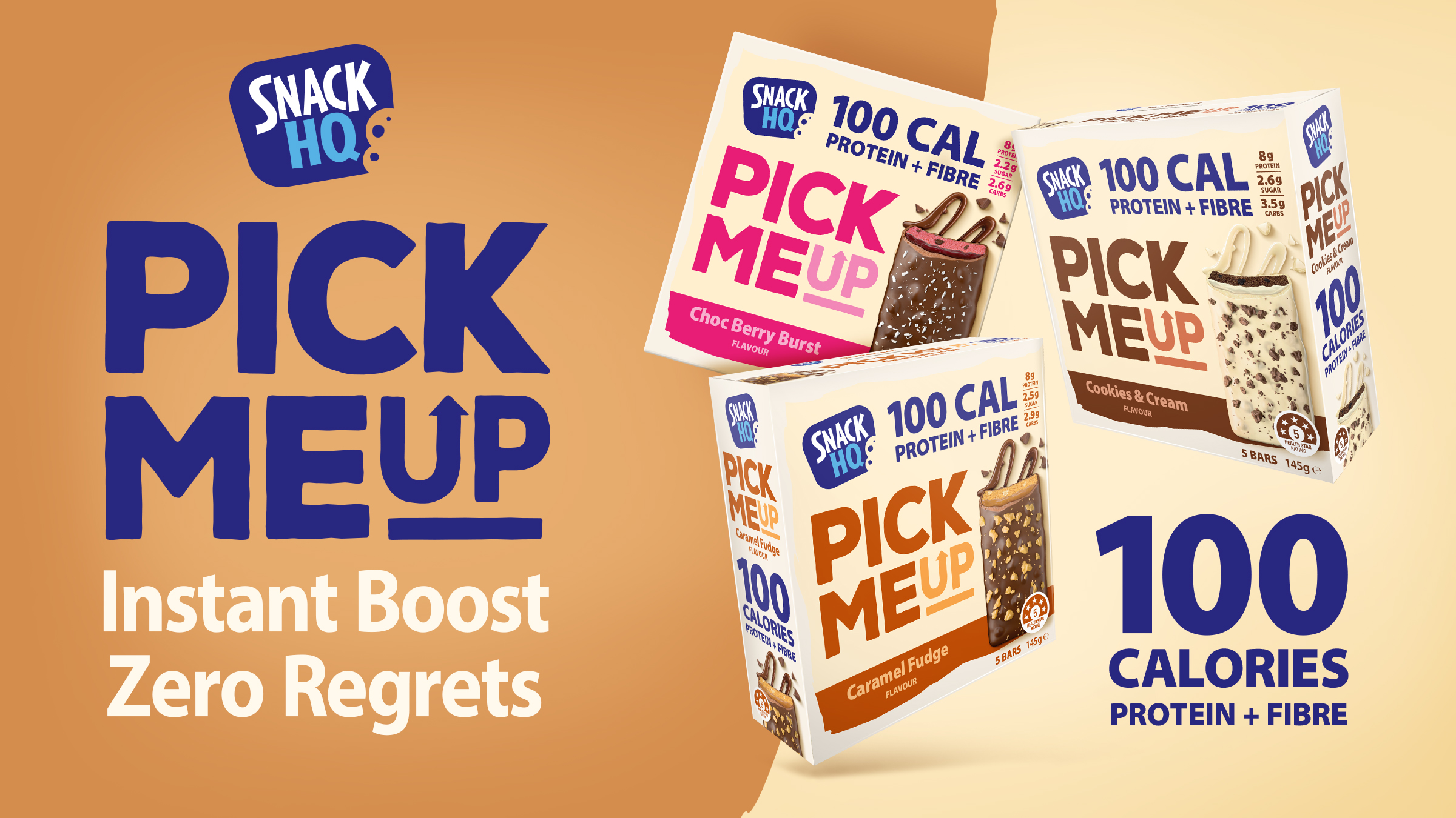
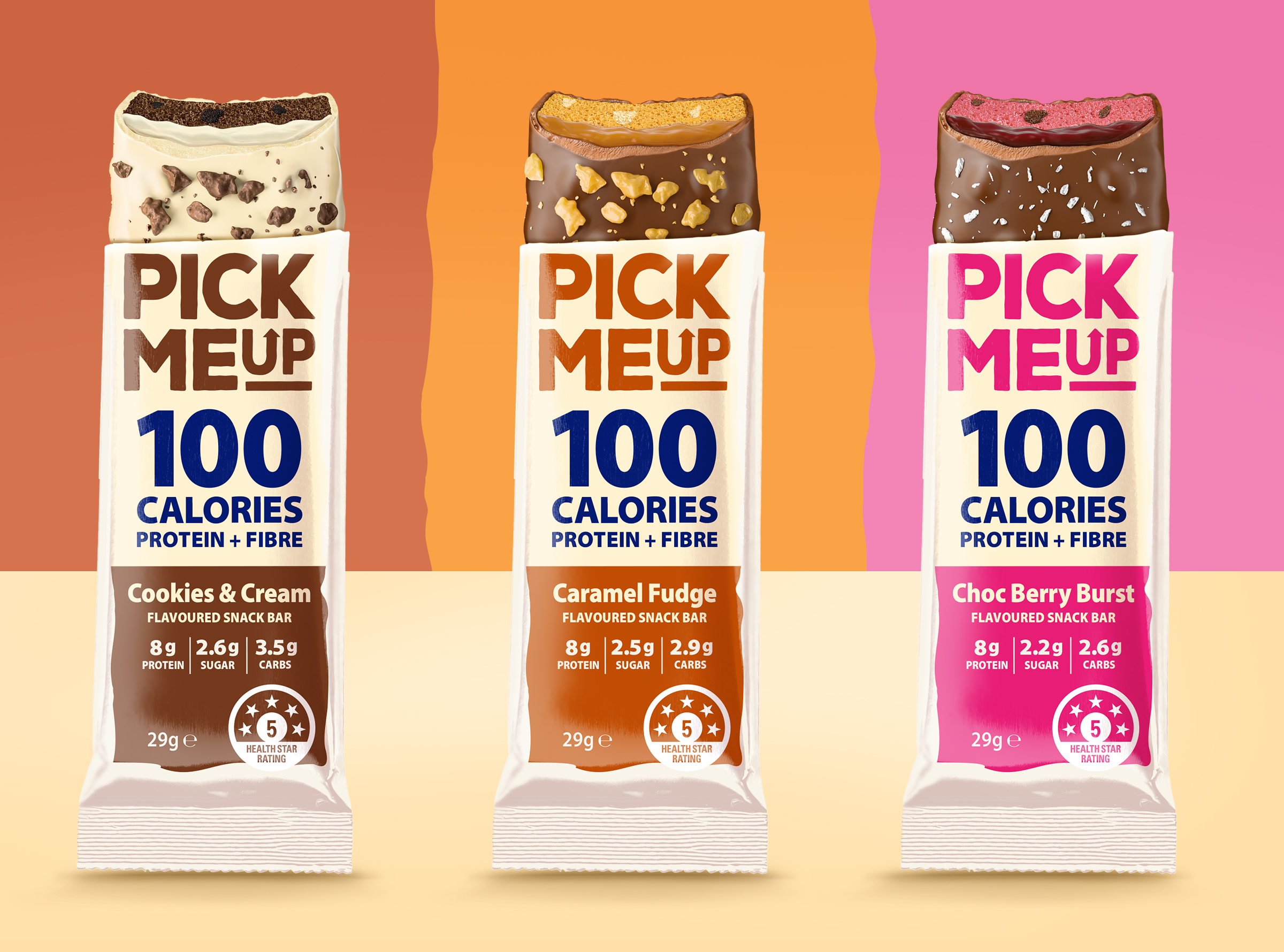
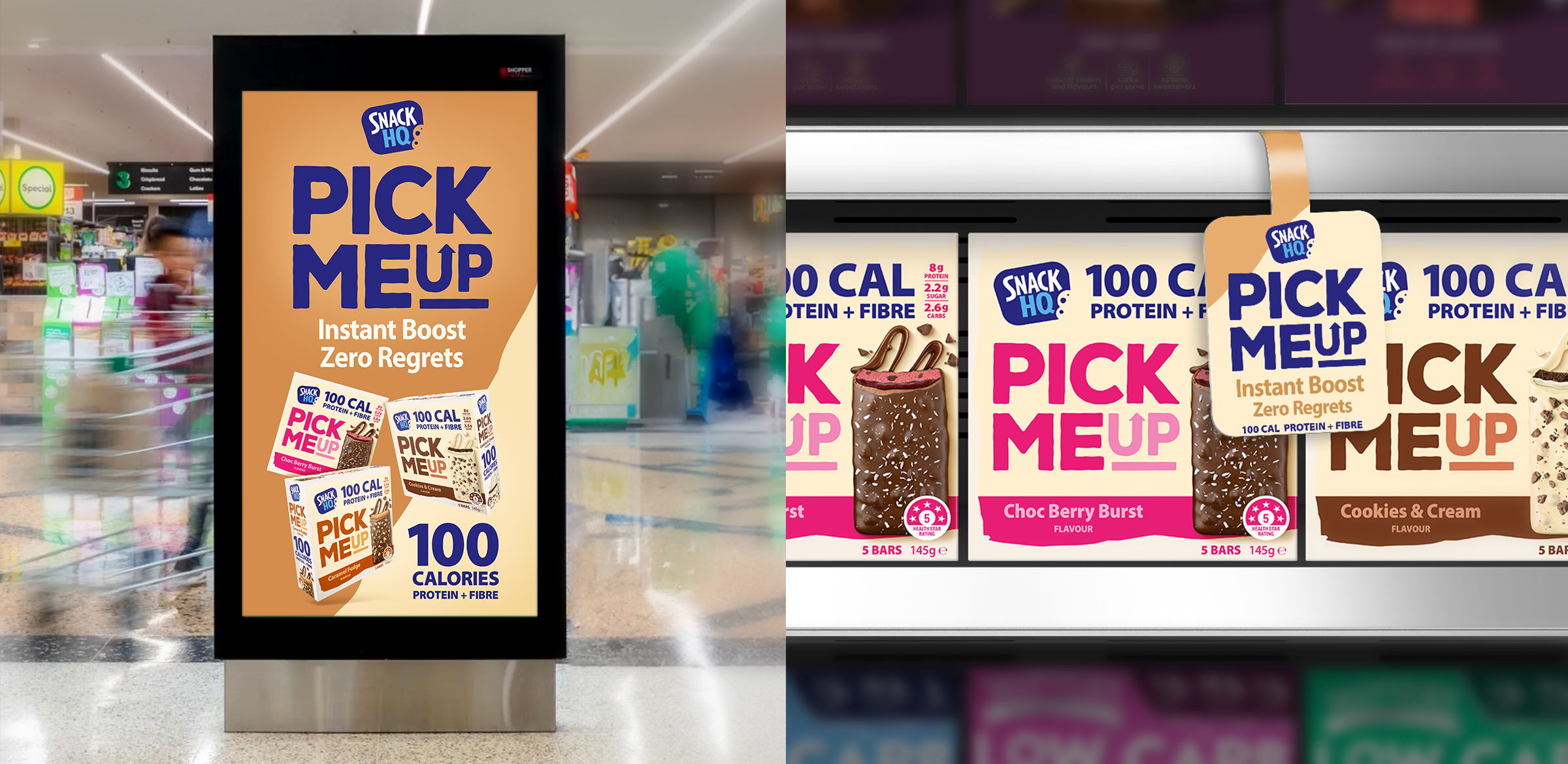
People want convenient, nutritious meals without compromise. Super Nature was crafted as a bold, vibrant brand that communicates freshness, quality, and wellbeing while standing out on the shelf. Its strong identity and enticing packaging reflect the brand’s commitment to real, wholesome ingredients.
The Impact
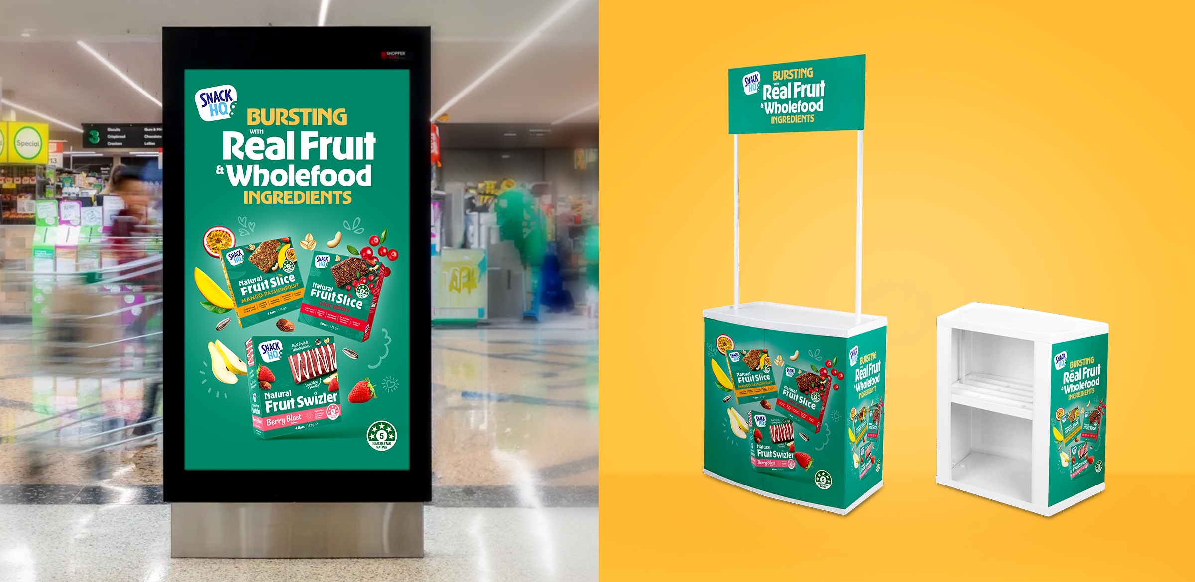
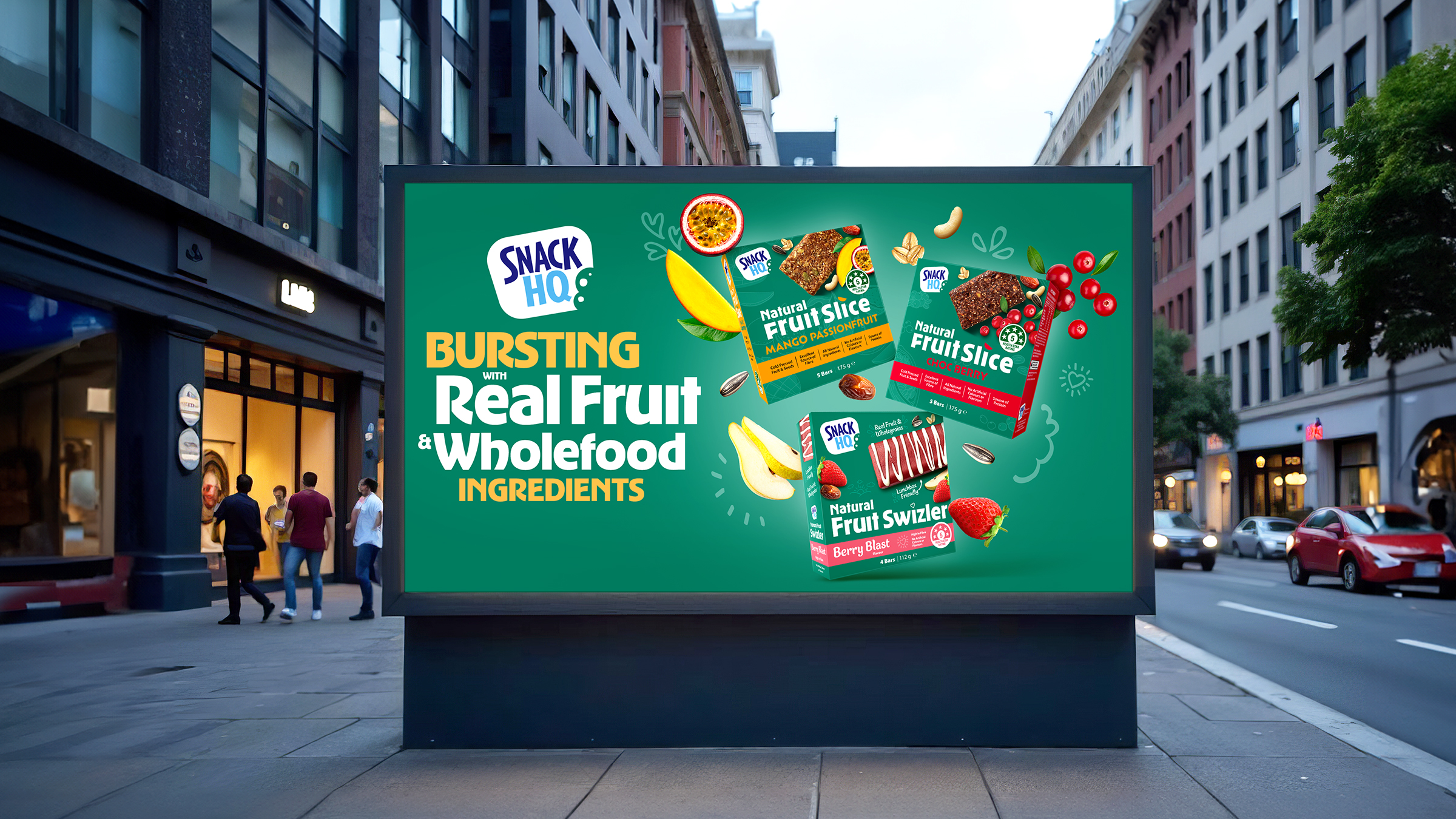
Super Nature has transformed the category, leading Australia’s convenience meal market in under six years. The introduction of Super Pulses further expanded its reach, proving that frozen meals can be a gateway to healthier eating without sacrificing taste or convenience.
The Challenge
Vesco Foods set out to reinvent the freezer aisle with a brand that could break stereotypes proving that frozen meals could be both healthy and delicious. The goal? To attract health-conscious consumers while maintaining strong taste appeal.
The Insight
People want convenient, nutritious meals without compromise. Super Nature was crafted as a bold, vibrant brand that communicates freshness, quality, and wellbeing while standing out on the shelf. Its strong identity and enticing packaging reflect the brand’s commitment to real, wholesome ingredients.
The Impact
Super Nature has transformed the category, leading Australia’s convenience meal market in under six years. The introduction of Super Pulses further expanded its reach, proving that frozen meals can be a gateway to healthier eating without sacrificing taste or convenience.